Week 1: Working with SpinBox and TextBox Enhancements#
What did you do this week?#
This week, my focus was on reviewing pull requests (PRs) and issues related to the user interface (UI) of the project. I meticulously went through each PR and issue, identifying those specifically associated with UI improvements. To streamline the process, I categorized them accordingly under the UI category. One of the key tasks was PR #499, which involved the implementation of SpinBoxUI. After rebasing the PR, I identified an alignment issue with the textbox component.
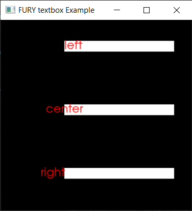
To resolve this issue, I started by investigating the root cause. I discovered that the alignment was initially based on the position of the parent UI, which caused the text to extend beyond the boundaries of the textbox. To rectify this, I devised a solution where I calculated the background size of the textbox and adjusted the text’s position accordingly. By aligning the text with the calculated size, I ensured a proper and visually appealing alignment within the textbox.
To provide a clear understanding of the improvement, I have prepared a comparison of the textbox alignment before and after the modifications.
Before:

After:

Did you get stuck anywhere?#
Fortunately, I didn’t encounter any significant challenges this week.
What is coming up next?#
Looking ahead, here’s what I have planned for the upcoming week:
