Note
Go to the end to download the full example code.
TabUI#
This example shows how to use fury.ui.TabUI to organize multiple
2D UI panels inside the same window.
Left click on a tab header to show its content. Left click on the active tab again to hide that tab’s content. Right click on a tab header to collapse the tab UI. The whole widget can be dragged from the tab header or panel background.
First, a bunch of imports.
from fury.ui import Disk2D, LineSlider2D, Rectangle2D, TabUI, TextBlock2D
from fury.window import Scene, ShowManager
Creating a Scene.
scene = Scene()
Create a TabUI with three tabs. The first tab is visible on startup.
Add content to the first tab.
rect = Rectangle2D(size=(90, 70), color=(0.9, 0.25, 0.35))
disk = Disk2D(outer_radius=45, color=(0.2, 0.75, 0.95))
caption = TextBlock2D(
    text="The first tab contains simple 2D shapes.",
    size=(340, 40),
    color=(1, 1, 1),
    font_size=16,
)

tab_ui.add_element(0, rect, (45, 75))
tab_ui.add_element(0, disk, (285, 110), anchor="center")
tab_ui.add_element(0, caption, (40, 205))
Add content to the second tab.
slider_label = TextBlock2D(
    text="A LineSlider2D can live inside a tab content panel.",
    size=(350, 40),
    color=(1, 1, 1),
    font_size=16,
)
slider = LineSlider2D(
    initial_value=35,
    min_value=0,
    max_value=100,
    length=300,
    orientation="horizontal",
    text_template="Value: {value:.0f}",
)

tab_ui.add_element(1, slider_label, (35, 65))
tab_ui.add_element(1, slider, (55, 150))
Add content to the third tab.
notes = TextBlock2D(
    text=(
        "TabUI groups several UI panels behind tab headers.\n"
        "Use TabUI.add_element(tab_index, element, coords)\n"
        "to place UI components in a specific tab."
    ),
    size=(360, 150),
    color=(1, 1, 1),
    font_size=15,
)

tab_ui.add_element(2, notes, (35, 70))
Add a status text outside the TabUI. The callbacks update this text when the active tab changes or the TabUI is collapsed.
status = TextBlock2D(
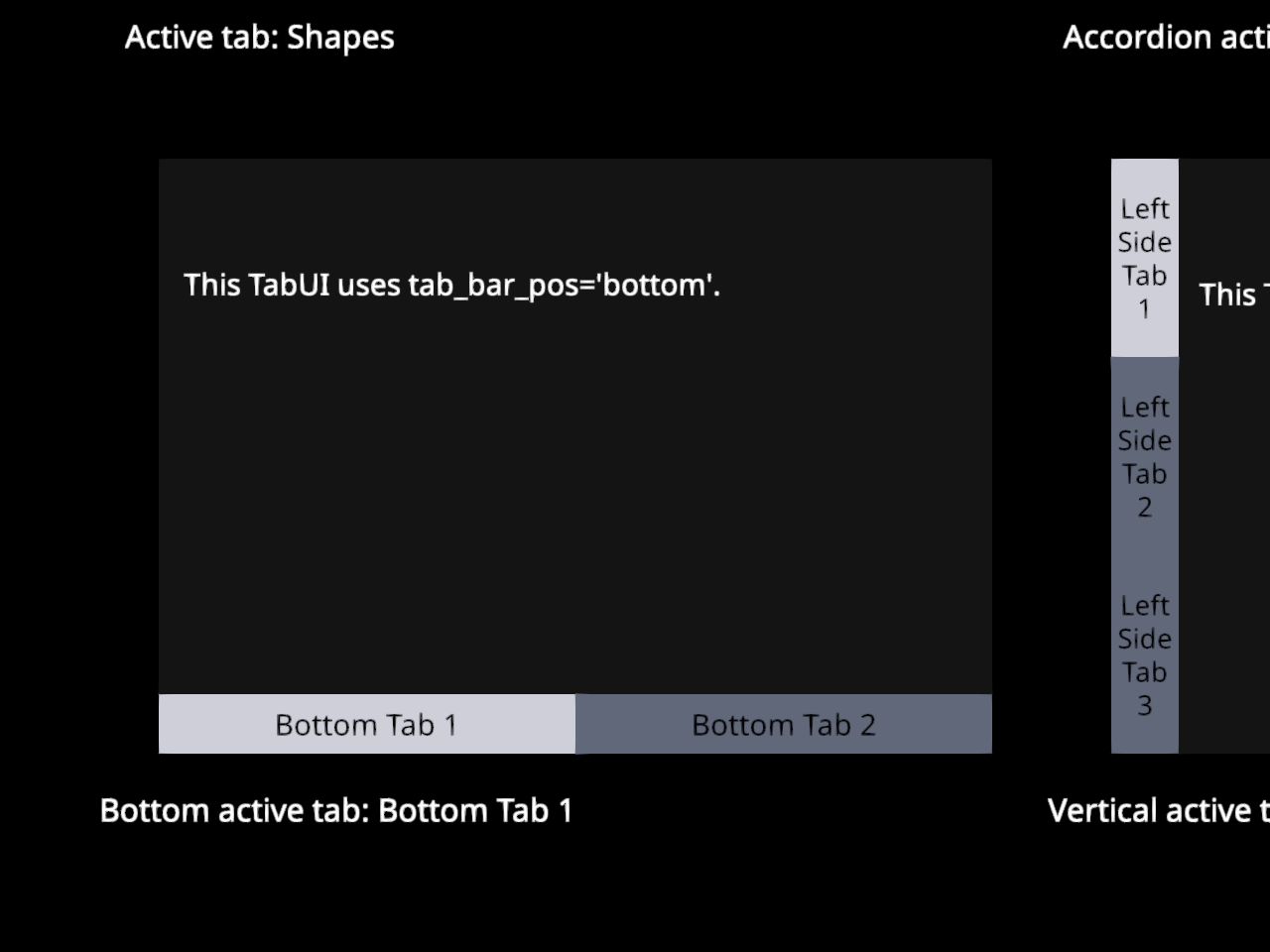
text="Active tab: Shapes",
position=(80, 430),
size=(420, 35),
color=(1, 1, 1),
font_size=16,
)
def update_status(ui):
"""Update status text after selecting a tab."""
if ui.active_tab_idx is None:
status.message = "TabUI collapsed"
else:
status.message = f"Active tab: {ui.tabs[ui.active_tab_idx].title}"
def collapse_status(ui):
"""Update status text after collapsing the TabUI."""
status.message = "TabUI collapsed"
tab_ui.on_change = update_status
tab_ui.on_collapse = collapse_status
TabUI can also use an accordion layout. In this mode each tab title spans the widget width. The active tab expands below its title while the other titles remain visible below the expanded content.
accordion_tab_ui = TabUI(
    position=(560, 80),
    size=(340, 320),
    tab_titles=["Info", "Color", "Help"],
    startup_tab_id=0,
    tab_bar_pos="accordion",
    font_size=15,
    draggable=True,
    active_color=(0.95, 0.95, 1.0),
    inactive_color=(0.45, 0.48, 0.56),
)

accordion_info = TextBlock2D(
    text="The active tab expands below its title.",
    size=(280, 80),
    color=(1, 1, 1),
    font_size=15,
)
accordion_square = Rectangle2D(size=(90, 90), color=(0.2, 0.8, 0.45))
accordion_help = TextBlock2D(
    text="Other tab titles stay visible\nbelow the expanded content.",
    size=(260, 90),
    color=(1, 1, 1),
    font_size=15,
)

accordion_tab_ui.add_element(0, accordion_info, (30, 45))
accordion_tab_ui.add_element(1, accordion_square, (125, 55))
accordion_tab_ui.add_element(2, accordion_help, (40, 45))

accordion_status = TextBlock2D(
    text="Accordion active tab: Info",
    position=(560, 430),
    size=(340, 35),
    color=(1, 1, 1),
    font_size=16,
)


def update_accordion_status(ui):
    """Update status text after selecting an accordion tab."""
    if ui.active_tab_idx is None:
        accordion_status.message = "Accordion TabUI collapsed"
    else:
        title = ui.tabs[ui.active_tab_idx].title
        accordion_status.message = f"Accordion active tab: {title}"


def collapse_accordion_status(ui):
    """Update status text after collapsing the accordion TabUI."""
    accordion_status.message = "Accordion TabUI collapsed"


accordion_tab_ui.on_change = update_accordion_status
accordion_tab_ui.on_collapse = collapse_accordion_status
The tab bar can also be placed at the bottom of the widget.
bottom_tab_ui = TabUI(
    position=(80, 500),
    size=(420, 300),
    tab_titles=["Bottom Tab 1", "Bottom Tab 2"],
    startup_tab_id=0,
    tab_bar_pos="bottom",
    font_size=15,
    draggable=True,
    active_color=(0.95, 0.95, 1.0),
    inactive_color=(0.45, 0.48, 0.56),
)

bottom_text = TextBlock2D(
    text="This TabUI uses tab_bar_pos='bottom'.",
    size=(330, 45),
    color=(1, 1, 1),
    font_size=15,
)
bottom_rect = Rectangle2D(size=(120, 80), color=(0.9, 0.65, 0.2))

bottom_tab_ui.add_element(0, bottom_text, (40, 55))
bottom_tab_ui.add_element(1, bottom_rect, (145, 65))

bottom_status = TextBlock2D(
    text="Bottom active tab: Bottom Tab 1",
    position=(80, 820),
    size=(420, 35),
    color=(1, 1, 1),
    font_size=16,
)


def update_bottom_status(ui):
    """Update status text after selecting a bottom tab."""
    if ui.active_tab_idx is None:
        bottom_status.message = "Bottom TabUI collapsed"
    else:
        title = ui.tabs[ui.active_tab_idx].title
        bottom_status.message = f"Bottom active tab: {title}"


def collapse_bottom_status(ui):
    """Update status text after collapsing the bottom TabUI."""
    bottom_status.message = "Bottom TabUI collapsed"


bottom_tab_ui.on_change = update_bottom_status
bottom_tab_ui.on_collapse = collapse_bottom_status
The tab bar can also be vertical. In this mode the tab headers stack along the left or right side of the widget and the content panel uses the remaining horizontal space.
vertical_tab_ui = TabUI(
    position=(560, 500),
    size=(340, 300),
    tab_titles=["Left Side Tab 1", "Left Side Tab 2", "Left Side Tab 3"],
    startup_tab_id=0,
    tab_bar_pos="left",
    font_size=14,
    draggable=True,
    active_color=(0.95, 0.95, 1.0),
    inactive_color=(0.45, 0.48, 0.56),
)

vertical_text = TextBlock2D(
    text="This TabUI uses tab_bar_pos='left'.",
    size=(250, 45),
    color=(1, 1, 1),
    font_size=15,
)
vertical_disk = Disk2D(outer_radius=42, color=(0.55, 0.35, 0.95))
vertical_rect = Rectangle2D(size=(105, 75), color=(0.15, 0.8, 0.75))

vertical_tab_ui.add_element(0, vertical_text, (35, 60))
vertical_tab_ui.add_element(1, vertical_disk, (150, 120), anchor="center")
vertical_tab_ui.add_element(2, vertical_rect, (105, 90))

vertical_status = TextBlock2D(
    text="Vertical active tab: Left Side Tab 1",
    position=(560, 820),
    size=(340, 35),
    color=(1, 1, 1),
    font_size=16,
)


def update_vertical_status(ui):
    """Update status text after selecting a vertical tab."""
    if ui.active_tab_idx is None:
        vertical_status.message = "Vertical TabUI collapsed"
    else:
        title = ui.tabs[ui.active_tab_idx].title
        vertical_status.message = f"Vertical active tab: {title}"


def collapse_vertical_status(ui):
    """Update status text after collapsing the vertical TabUI."""
    vertical_status.message = "Vertical TabUI collapsed"


vertical_tab_ui.on_change = update_vertical_status
vertical_tab_ui.on_collapse = collapse_vertical_status
Now that all elements have been initialized, add them to the scene.
scene.add(tab_ui)
scene.add(status)
scene.add(accordion_tab_ui)
scene.add(accordion_status)
scene.add(bottom_tab_ui)
scene.add(bottom_status)
scene.add(vertical_tab_ui)
scene.add(vertical_status)
Starting the ShowManager.
current_size = (980, 900)
show_manager = ShowManager(
    scene=scene,
    size=current_size,
    title="FURY TabUI Example",
)
show_manager.start()
Total running time of the script: (0 minutes 0.745 seconds)