Week 15 - Highlighting DrawShapes#
What did you do this week?#
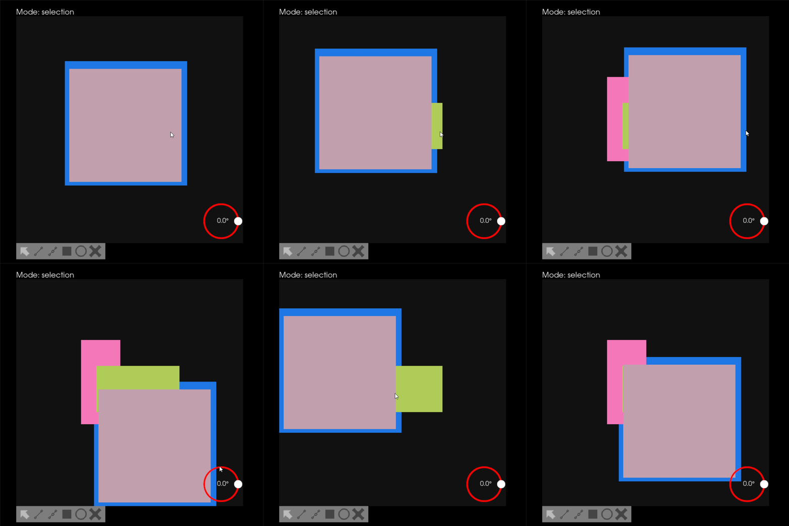
This week I started with highlighting the shapes. As discussed earlier, I had two ways, but while implementing them, I found out both ways aren’t that good to continue with. The first way in which we thought of creating the scaled shapes in the background had an issue with the stacking. The border(blue rectangle) and the shape(grey rectangle) both seem to look like different shapes just grouped together as shown below.

While playing around with the second way, which was to add yellow color to the shape to make it brighter, it was difficult to identify which shape was selected. Also sometimes instead of making it brighter the addition of color created a new color which again confused the user. After discussing these issues my mentors suggested having a user-defined highlight color that will be shown whenever the shape is selected.

Along this, we were also trying to integrate shaders to the Actor2D (i.e. the UI elements) but there were some issues with it. I used this shaders example as a starting point and just replaced the utah actor by Rectangle2D actor. This program executed successfully without any errors, but it didn’t give the required output.
So instead of wasting time searching for how it is done, we thought it would be great if we directly ask in the VTK discourse forum. For this, I had to create a minimalistic pure VTK code. You can check out my code as well as the post here.
Did you get stuck anywhere?#
No, I didn’t get stuck this week.
What is coming up next?#
Working on the rotation slider and the polyline.
